views
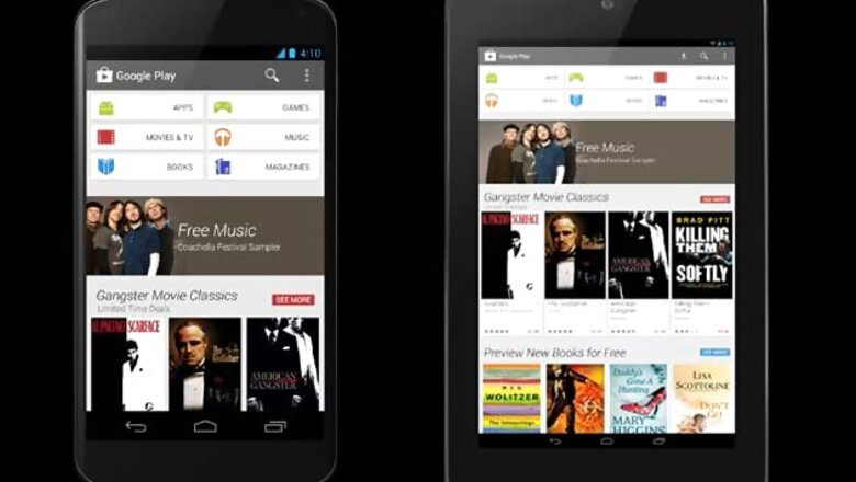
Mumbai: After weeks of leaks, Google has begun rolling out a new design for the Play Store. The Store now sports a cleaner user interface, all the categories are now neatly grouped together, and the payment process has undergone some improvements.
In a blog post showing off the swanky Card-based layout, Michael Siliski, Group Product Manager for Google Play said that the store was not only simple and clean now, it also makes it easier to find great entertainment faster.
The blog mentions that the rollout process is expected to take a few weeks to complete, so if you are still seeing the older version of Google Play, do not fret. You should be receiving an update any day now.
The new design is pretty image heavy, but is easier on the eyes thanks to ample use of white space in the design. It looks like the home page now no longer contains featured apps but shows off movies and books.
At the top of the main page are two rows containing three categories each. Siliski writes that similar themed content has now been strung together so it becomes easier for you to discover new apps, movies and books on the Store.
As you move down the page, new recommendations will keep popping up on it.
Siliski also wrote that the buying process has been simplified. Although he did not specifically mention what exactly had changed, the blog mentions that you can now "breeze through" the check out process while you're buying apps or renting movies.
To read more visit: www.tech2.com






Comments
0 comment