
views
Getting Started

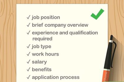
Decide what information you'll put on the poster. This depends on what in particular you're advertising. If you're advertising for your store or business, you'll want to include your location, hours, and contact information. If you're advertising a group or organization, you should include when and where you meet. You should include any information that viewers of your poster should know.

Decide what demographic you're advertising to. Understanding your market is crucial for any form of advertising. For you, understanding your market will determine where you place your posters, as well as how you word your advertisement. For example, if you are advertising a proofreading service for graduate students, the term "thesis" may catch their eye more than just "essay." Decide what your target demographic is and then investigate phrases, graphics, and other design strategies that will appeal to your intended audience.
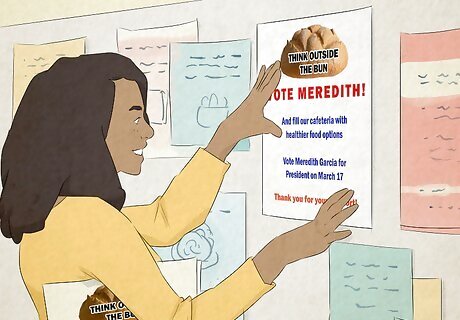
Decide where you will place your posters. Part of this you will figure out while investigating your demographic. For example, you wouldn't place a flyer for your punk rock band at a preschool. But location also influences the design of your poster. When you decide where your target demographic usually congregates, investigate the space. Look at where you can place your poster so the most people will see it. Also keep in mind that posters in places where people move, like hallways, tend to attract less attention than places where people have to wait. For example, a bus stop is a place where people have to wait, and their eyes will probably wander while they do so. A poster visible from a bus stop is more likely to be noticed than one in a school hallway. Look at the colors and lighting of the area. You'll want your poster to stand out rather than blend in, so pick colors and designs that will contrast with the surroundings.

Decide what message you want to convey with the poster. Advertising involves conveying an idea about a particular product or group. In beer commercials, for instance, the product is usually associated with having fun and going out. Decide what you want your audience to associate with your advertisement. If you are making posters for your store, you'll probably want to show pictures of people smiling while shopping, demonstrating that your store is a place to be associated with good feelings.
Designing Your Poster

Learn the essential parts of an advertising poster. Like an essay, advertising posters have three parts: headline, body, and signature. To design a great poster, make all three components strong and eye-catching. Headline. This is the part that should grab the reader's attention. It is usually at the top of the poster and is in the biggest font. It should be short- less than 15 words- or your reader will get bored and walk away without reading the rest. Try to come up with a great phrase that conveys a message about your product and makes the reader want to look at the rest of the poster. Body. Underneath the headline should be one or two sentences that advertise your message. They can be longer than the headline, but again short enough to keep the reader interested. Highlight only a few key points that you want readers to know and to entice them. Signature. Here is where you'll place your company, store, group, or whatever you're advertising. Include all relevant contact information like address, phone number, email, social media pages, websites, and hours of operation. It is usually at the bottom of the poster.
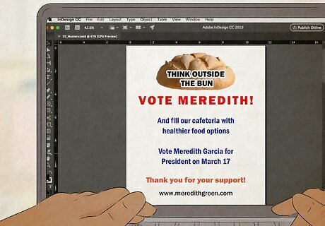
Find a computer program to help design your poster. Although you can hand draw your poster, usage of specialized computer programs can open a lot of possibilities for your poster. If you are trained in using Adobe products, you may choose to use Adobe InDesign or Illustrator. If you are not well-trained, you may choose a template-based program, such as Apple's Pages or ArtSkills.com's Poster Maker.

Design a logo. If you're advertising for a company or organization, you should consider designing a logo if you don't already have one. This will not only grab your readers' attention, but you can start building a recognizable trademark. If your advertisements make you successful, you could even design posters with just your logo, because readers will already be aware of what you are advertising. Coca-cola is a prime example of this.
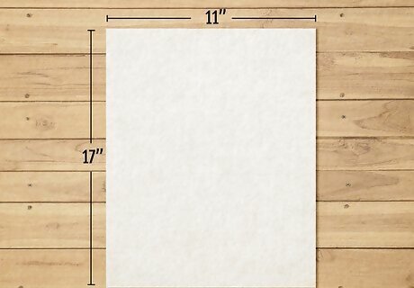
Choose an effective size for your poster. Bigger is not always better when it comes to advertising posters. While you'll be tempted to go as big as possible, this could actually hurt you. Besides being very expensive, large posters in small spaces overwhelm readers. Readers will probably be unwilling to read an entire poster if it is as tall as they are. For indoor posters, 11'x17' is usually fine. Save large posters for outdoor ads on buildings or billboards.
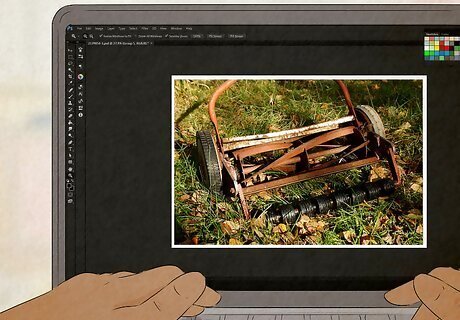
Choose a few effective images. You don't want your poster to be too crowded- most great ads are simple. Too many images will overwhelm and confuse the reader. Choose one or two good pictures that really convey your message and place them front and center. Then design the words around the pictures to ensure that words don't cover up any scenes that you want your readers to notice. Always use high-resolution images. Although low-resolution images may look normal when they are on your computer, they may look blurry or pixelated when they are printed.
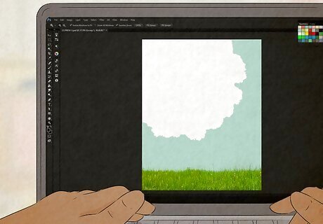
Use colors that will stand out. After deciding on images, decide which colors will match that image well. Use colored paper to further accentuate text. Colors that usually work well are white text on red paper and black text on yellow paper. Avoid neon colors, though, as they usually overpower the text. Don't go crazy with colors. The same way as too many images will overwhelm the reader, too many colors will also overload them. Three or four colors is usually enough to attract attention but not so much that readers will be overwhelmed.
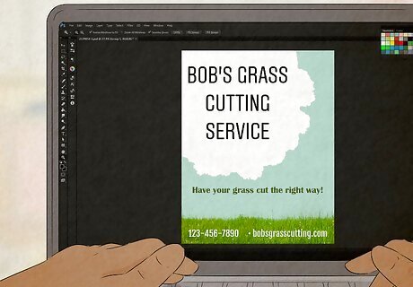
Use text that is readable from several steps away. Remember that people might be moving when they see your posters, so make sure the text is legible. When evaluating your poster, hang it up and step back about 15 feet. If you have trouble reading it, consider revising the text. You could do this by making text larger, using a different color, or both. Try to use only three different fonts on your poster- the headline in the largest, the body in the next size, and the signature in the smallest. Too many sizes will bore the reader and they will probably stop reading the poster.
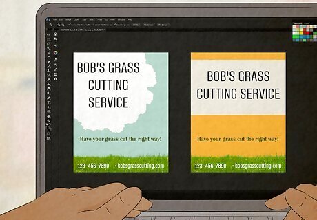
Make several drafts before picking a final choice. Just like your writing needs proofreading before it is ready for publication, your poster should be reviewed several times before you print it. Make a few versions and consider if it is eye-catching, simple, and conveys the message you want it to. Ask others for their opinions as well- another set of eyes will see things you may have missed. Revise the poster until you feel it is as strong as it can possibly be.
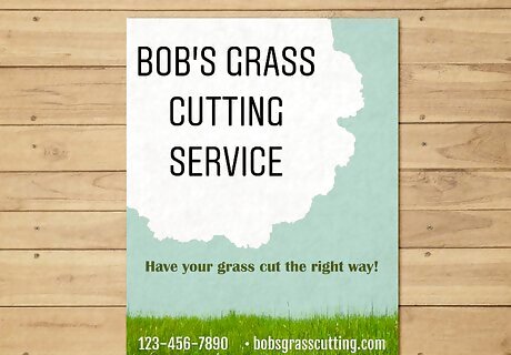
Print your poster. When you've designed a poster you're happy with, you have several choices for printing it. You could print it right from your computer at home if you're on a budget. Computer paper, however, isn't very durable, and colors and pictures don't look as good as they could. Printing shops, however, can use heavy-duty paper and give your posters a vibrant glow that will attract readers. Printing can be very expensive, however, so keep your budget in mind. Make the choice that is best for you and your situation.







Comments
0 comment