views
On the night of September 12th, I was excited beyond measure, thanks to Apple finally releasing the stable build for all iPhones, including 8 and later. The excitement was unfortunately marred by an unreasonably long wait once the update finally showed up on my iPhone 12 Mini. Not only did it take an eternity to install, starting with an ETA of 30 minutes that a few moments later became a couple of hours, but the update rendered my iPhone 12 Mini unresponsive for at least, a few minutes upon first booting up with iOS 16. Read on to know how iOS 16 has spiked nothing but mixed feelings for me.
WATCH VIDEO: iOS 16 Launched: Here Are The Top Three iOS 16 Features
Lets Start With What’s Good:
The New Lock Screen Is A Breath Of Fresh Air
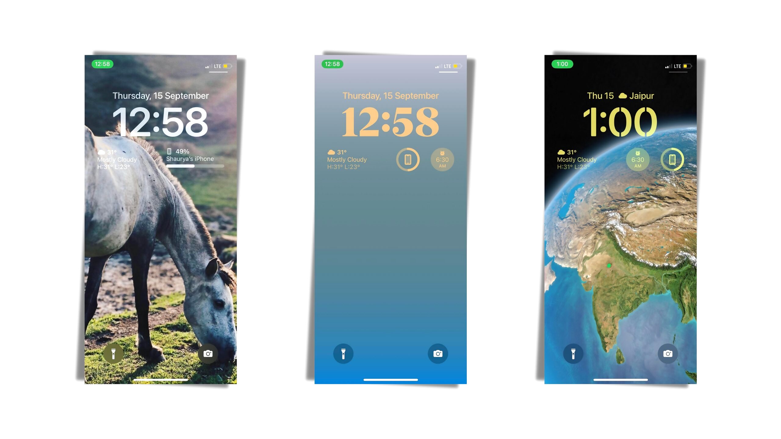
Let’s start with everything fresh and enticing that I immediately noticed on my mini starting with the stunning lock screen. I can’t possibly stress this enough but Apple’s new lock screen is now my most favorite lock screen implementation ever! I remember using One UI on my old Samsung S10 only to be wowed by its extensive customizability. But as things stand, I’ve grown to enjoy a simpler, uncluttered experience on my devices. Also, the iOS 16 lock screen strikes a perfect balance between being minimal and customizable enough without overwhelming me with a myriad of options.

Apple’s implementation allows for the fonts to be changed, widgets in a couple of sizes and a new notification centre. Right off the bat, I’m not a fan of the new notification center (more on that later). However, the subtle nuances, and how seamlessly new kind of live wallpapers integrate with the lock screen, are very cool to experience. I’ve been changing wallpapers like crazy ever since installing iOS 16 and four days later, I still can’t get enough. The five new Astronomy wallpapers and the minimalist color wallpapers are my favorite of the bunch.
Haptic Feedback For The Win
Haptic feedback while using the keyboard is finally a thing now on iOS. I’ve missed the satisfying sensation that I’ve been enjoying on my Pixel. But the fine people at Apple decided that it was finally time. The feedback strength while typing is not adjustable, or at least, I couldn’t find it. But it is satisfying, clicky and brings joy to my life. I missed it on iOS and I’m glad that it’s here.
Speaking of performance, well, my iPhone 12 Mini is still just as smooth when it was on iOS 15, if not smoother. However, occasionally, like once or twice in the past couple of days, I’ve noticed a few frame drops while using switching between Twitter and WhatsApp. I’m hoping that it gets fixed in a software update. So, this is where ‘what’s good’ ends.
WATCH VIDEO: Confused Which Smartphone To Buy Under Rs 30,000? Here Are Some Of Our Favorite Phones (September 2022)
Battery Life Woes
If there’s anything that’s forcing me to roll back to iOS 15.7 it’s the atrocious battery life. Don’t get me wrong here because the iPhone 12 Mini’s battery was already poor to begin with but after iOS 16, it barely lasts half as long as it did on iOS 15. I got a screen on time of around four and a half hours using iOS 15, but now, I would consider myself lucky if I could get past the two-and-a-half hour mark. It’s just bad. There’s no two ways about it.
Now, I know that battery life can suffer for a couple of days after a major update, due to software indexing and a plethora of other technicalities, but today, after almost four days, I started my day with a 100% charge at 8AM. It is currently 12:45PM and despite not using the phone for any stressful tasks like filming, the battery is already at 51%, with less than 40 minutes of screen time.
If Apple doesn’t fix this with a software update, I’ll just switch to a new phone or perhaps retire the 12 Mini until a new phone speaks to my senses.
New Notification Centre Is A Mixed Bag
Despite all the chances Apple has had to fix iOS notifications, they have availed none. In fact, I feel, the new notification centre that is now accessible by swiping up from bottom, makes the whole experience impractical and jarring. Now, I do understand there’s a new learning curve right now, but I’ve been constantly missing notifications over the last few days. There are different schools of thought and I’m certain that someone out there might be absolutely adoring the new system but for me, personally, the experience represents a big missed opportunity and mind you, that’s a big “big".
I haven’t had the chance to speak to my colleagues about how iOS 16 is behaving on their iPhones but as things stand, I’m reverting back to iOS 15 for the time being. The notion that I had built surrounding my expectations from iOS 16 is now, defunct.
Read all the Latest Tech News and Breaking News here


Comments
0 comment